
Maura Mackey is a Cork-based interior and retail display designer. A professional with an eye for detail and interior styling, she thrives on giving any home the ‘showhouse feel’ when up for sale or rental from a home staging point of view. On the other hand, if you are looking to give your home a makeover or restyling, ‘Maura Mackey Design’ will help you achieve the home of your dreams. P: 087-7699714. maura@mauramackeydesign.ie
White kitchens are a favourite in the interiors world because, like a blank canvas, they allow you to create so many different looks, now and in years to come. Contemporary, traditional, farmhouse and Scandinavian, it’s a colour that suits every design taste and, because white reflects light to make smaller areas appear more spacious, it can be used in any design scheme no matter what size room you have.
Like every colour, there are multiple ‘shades’ of white with either warm or cool undertones. Cabinets and paint samples can look very different in a showroom’s light to how they will look in your kitchen at home. I always remind my clients to be mindful of this; before you choose your shade, think about how much and what type of light is coming into your kitchen.
For example, if your kitchen is north facing, do not pick a white with a blue undertone, as it will make your kitchen feel cold. Instead choose a warm white. For walls, a favourite of mine is ‘Cornforth White’ from Farrow and Ball.
If you have a lot of light streaming into your kitchen from south or west facing windows then the choices are endless. A good off-white wall paint is ‘Hardwick White’ from Farrow & Ball, it can look like a traditional grey depending on the light and is a great choice for a bright kitchen space.
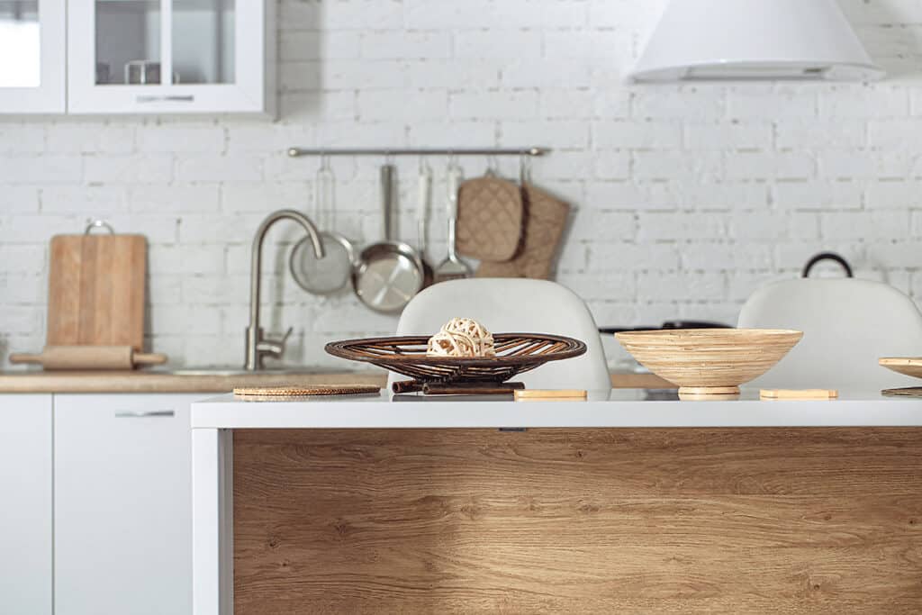
Bringing contrasting materials into a white kitchen design adds character, warmth and personality. Think about natural materials with a texture or a grain; wood or stone for your worktop, flooring or backsplash for example. (While I’m on the topic of worktops, I must mention a brand that is fabulous if you have young kids or do a lot of cooking – Dekton have a wide range of textured worktops to choose from but the big plus for me is you can put hot pans and trays down without marking them.)
Brass, copper and other metallics also stand out in a white kitchen. Use in lighting over an island or dining table, for accessories such as a kettle and toaster or think about metal as a feature wall.
Create layers of interest by mixing up your sheens; if you have matte kitchen cabinetry, maybe add a gloss tile or backsplash to create a contrast and reflect light around the kitchen.
Another way to create dramatic contrast is with a dark floor in an interesting pattern. A herringbone pattern in dark ceramic tiles, luxury vinyl tiles or parquet flooring would look amazing.
For more drama add pops of colour with:
• Painted stand-alone cabinetry
• House plants in interesting pots
• Window dressings
• Brightly coloured appliances
• Wall panelling
• Paint ‘sections’ of your kitchen walls
Finally, for wall colours that set off white cabinets there are no wrong or right choices but a few of my favourites that my clients have used in the Farrow & Ball range are French Grey, Hague Blue and Pigeon.