The shape of things
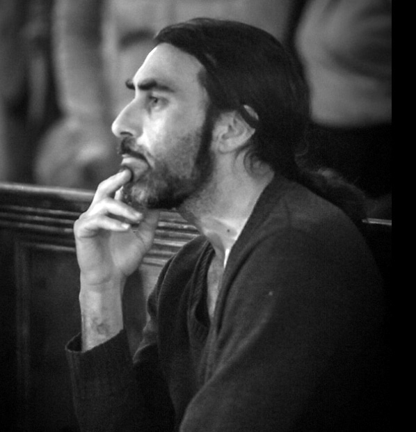
James Waller is an Australian born artist and poet based in West Cork. Through this column James explores the world of art, introducing the reader to major works of art and artists and reflecting on what makes them so engaging.
James offers a range of studio-based courses for children and adults in Classical painting, drawing and printmaking at Clonakilty School of Painting. See www.paintingschool.
jameswaller.org for details.
Colour values in Western art have undergone many shifts, from the ancient Greek through to the Medieval, Baroque, Modern and neo-Baroque. The classical Greek values, echoed in the Renaissance (16th c.) and the Baroque (17th c.) are grounded in earth: their colour value system is one of muted, ‘blended notes’, striving for realistic portrayal. By contrast the medieval and the modern are bursting with colour; their systems are of ‘graduated notes’, ‘separated notes’ and ‘intermingled notes’.
All of these colour value systems are alive today. Faced with such a plethora of paths it can be difficult for a painter to know which way to turn. Discovering the mode, or modes of expression, which best serves you, is a major part of one’s creative journey. Likewise, in looking at art, discovering what it is you respond to is a big part of one’s journey of self-discovery.
My very first forays as a young painter were under the influence of the modernist, Paul Gauguin. His colour arrangements (of ‘intermingled notes’) thrilled me with an incredible sense of recognition; colour sat beside colour in a seemingly effortless mosaic of the soul, the outer world a mantle on which to clothe the inner one. My first self-portrait in oil was like this. It had none of the slick finesse and sophistication of a classical painting; it was raw and dry, its colours modernist and slightly acidic. But it was and remains a true ‘mosaic of soul’, a colour arrangement, which floods me to this day with profound recognition and fulfillment.
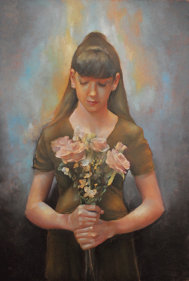
‘Flower Girl’: oil on canvas, 2021 (intermingled notes). 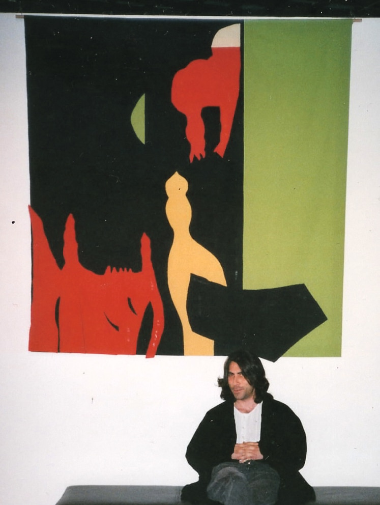
‘Angel Dog’: textile cut out, 2000 (separated notes).
A few years later, under the heady influence of Matisse, I found myself creating large scale ‘cut-outs’, carving out shapes of flat colour in rhythms and movements which I found spell-binding. I was colour-drunk and giddy with the freedom and beauty of what I had unleashed. One work, titled ‘Angel Dog’, felt like the ‘true colour-shapes’ of my soul. These works were examples of ‘separated colour notes’ such as we see in Matisse’s cut-outs, the paintings of Albers and other hard-edge abstract painters.
During these colour-drunk years I also studied the meditative art of icon painting. I learnt to mix and layer ascending notes of colour, methodically developing folds of garments and skin tones as ‘ladders of light’, following a 1500-year-old aesthetic system as faithfully as I could. The icon revealed to me the power of luminous light. It also introduced me to ‘graduated colour notes’, which we find in both medieval and modernist painting (Giotto is an example of the former and Paul Klee a good example of the latter).
Over the last eight years I have immersed myself in Baroque realism (think Rembrandt and Caravaggio). The blazing colours of my youth have been brought to heel; muted and blended they have learned to serve realistic form. This has been, on the one hand, deeply satisfying, and on the other somehow lacking. In none of my neo-Baroque figures can I feel the ‘mosaic of the soul’, that arrangement of colours which has haunted me since my youth.
Through printmaking, however, I have kept my ‘modernist’ identity alive, quietly printing sequences of abstract ‘fugues’, which employ a system of ‘graduated colour notes’. Azure blue predominates in these sequences (it has ever been the colour closest to me). This is significant as Baroque realism largely gives the blues a wide berth. Don’t tell my Baroque buddies, but all these years I’ve been binging on blue in secret!
Finally, in my new collection, titled ‘Balance the Roses’, I am bringing the ‘blue fugues’ and the ‘Baroque figures’ together. In the process those figures are becoming infused with the blues. And so the journey of ever-evolving identity continues…
‘Balance the Roses’ is showing at the Clonakilty Community Art Centre, Asna Square from July 9-30. Open Tues-Sun
11-5 pm.